< Back to Style Guide
Cards
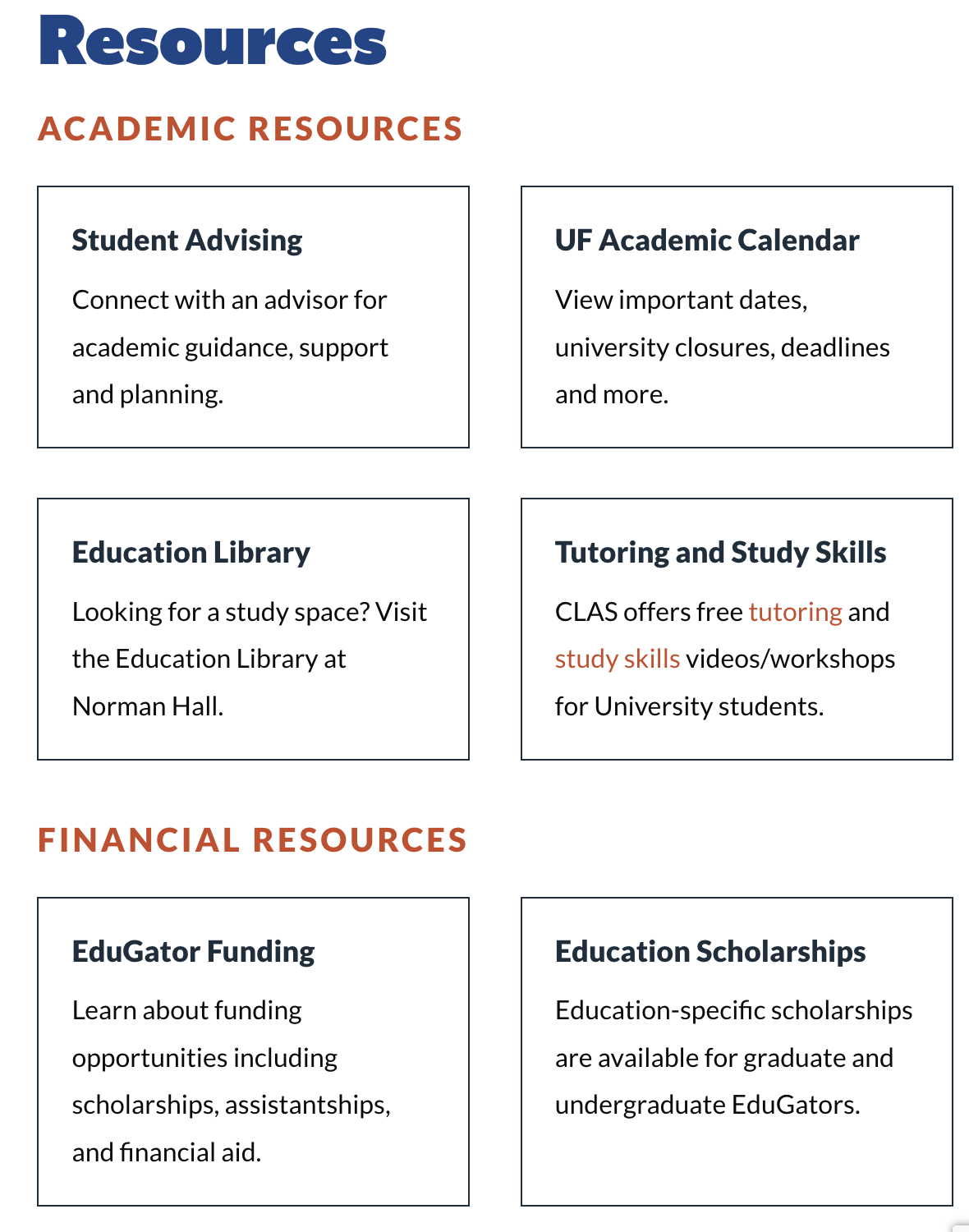
Lists of cards are used as entry points to navigate to different sections or topics within the website.
- Use cards to contain related elements
- Contents can include anything from images to headlines, supporting text, buttons, and lists
- Cards can contain other components
- Cards have flexible layouts and dimensions based on their contents
Usage
Use a card to display content and actions on a single topic.
Cards should be easy to scan for relevant and actionable information. Elements like text and images should be placed on cards in a way that clearly indicates hierarchy.
Cards can serve as entry points into deeper levels of detail or navigation, such as a program pages and resource lists.


Content
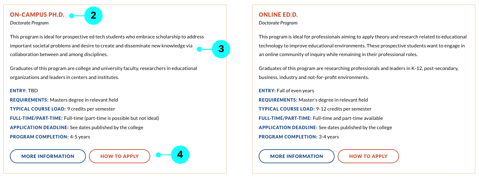
1. Image
- Provide alt text for images to ensure accessibility for screen readers and users with visual impairments.
- Use high-quality images that are relevant to the post content.
- Ensure images are visually appealing and align with the overall tone and message.
2. Heading
- Create clear and concise headings that accurately reflect the content of the post.
- Use engaging language to capture the audience’s interest.
- Follow brand guidelines for font styles, sizes, and colors to maintain consistency.
- Ensure headings are SEO-friendly by including relevant keywords.
3. Content Excerpt
- The content excerpt provides a brief summary or teaser of the news or blog post, enticing readers to click for more information.
4. Call-to-action
- Use clear and actionable language in CTAs to encourage user engagement.
- Place CTAs strategically within or at the end of the post for maximum impact.
- Use contrasting colors or design elements to make CTAs stand out and attract attention.
- Test CTAs to ensure they are clickable and functional across different devices and browsers.
Grid style with images


Grid style with no images

